Your Use of Double Check Pattern May Not Be That Great!

What is the Double Check pattern?

Synchronization in any programming language is considered to be expensive. The Double Check pattern is simply a way to try to eliminate locks by first testing for the existence of a resource without holding a lock and return the resource directly if it existed. If it didn’t exist, a lock is obtained and the check is done again, and if the resource still doesn’t exist, it’s created and returned. In Java it would look something like this:


class DoubleCheck {
private SomeResource myResource;
public SomeResource getResource() {
if(myResource != null) {
return myResource
}
synchronized(this) {
if(myResource != null) {
return myResource
}
myResource = new SomeResource();
return myResource
}
}
}

Why are two checks cheaper than one?

Locks can be expensive to manage. First of all, there’s the obvious situation where the lock is held by someone and your code has to wait. But even if no one is holding the lock, there could be some performance implications. Locks can be implemented in many different ways, but they all need some kind of so called atomic instruction. These are machine code instructions that guarantee thread safety at the hardware level. What this means is that they have to halt all other cores and hardware threads for a brief moment. There are also implications on hardware caches that could further slow down execution. Experiments have shown that an atomic instruction can be up to 30 times slower than its non-atomic counterpart.

So checking something without holding a lock seems like a much quicker way. Now the lock only needs to be held while a new resource is created. Most of the time, you’d just get the resource back without acquiring a lock! Great, isn’t it?

A Blatantly Broken Example

Recently I saw some code in a widely used package that prompted me to alert the maintainer. Someone was trying to save a few nanoseconds using a Double Check pattern in a place where it definitely didn’t belong. Here’s the essence of that code:


class BrokenDontUse {
private Map<String, SomeResource> aHashMap = new HashMap<>();
public SomeResource getResource(String name) {
SomeResource r = aHashMap.get(name);
if(r != null) {
return r;
}
synchronized(aHashMap) {
SomeResource r = aHashMap.get(name);
if(r != null) {
return r;
}
r = new SomeResource(name);
aHashMap.put(name, r)
return r;
}
}
}

It should be pretty obvious why this is broken. A HashMap is inherently unsafe and the put operation may completely rearrange its internal structures. If the get should happen to execute at the same time, chances are very high that you’ll end up with strange results and very hard to find bugs.

In this case, you can still use the Double Check pattern. In fact, the code above only needs to change a single line to be safe. Instead if instantiating the Map as a HashMap, you could use a ConcurrentHashMap. This variant of a Map uses some clever tactics internally to make sure most accesses can take place without locks being acquired, while being guaranteed to be thread safe.

This ensures that we won’t run into strange bugs stemming from race conditions in the HashMap. But is this code really thread safe? Well, it depends…

Why Double Check May Be a Bad Idea

Even if you avoid the obvious HashMap problem, there’s still some potential issues here. Consider this code where we want to record when something was accessed for the first time. We could do that using a Double Check.


class QuestionableUseOfDoubleCheck {
private long firstAccess = –1;
public long accessSomething() {
if (firstAccess != –1) {
return this.firstAccess;
}
synchronized (this) {
if (this.firstAccess != –1) {
return this.firstAccess;
}
this.firstAccess = System.currentTimeMillis();
return this.firstAccess;
}
}
}

Looks pretty safe, doesn’t it? Well, on most modern processors this code IS safe. Storing and reading a 64-bit long should require a single instruction and a single access to memory across its 64-bit wide bus. But there’s no guarantee that’s the case. In fact, the Java spec explicitly states that 64-bit assignments are not guaranteed to be atomic. So what if someone tried to run your code on a 32-bit machine, like a Raspberry Pi? There’s a chance you’d see a timestamp where only half of the 64 bits had been updated!

Luckily, in Java there’s the volatile keyword. By declaring “firstAccess” volatile, you would guarantee that accesses to it are atomic. But guess what? Depending on your platform, you may now have introduced the need for an atomic instruction, which is what we tried to avoid in the first place!

Your JVM is Probably Smarter than You!

As we have seen, there’s really no safe way of avoiding synchronization or atomic accesses. And when it comes to synchronization, you should understand that in most cases, it’s pretty fast. Most languages implement synchronization something like this (pseudocode):


int waiters = 0;
void acquireLock() {
if(atomicIncrement(waiters) == 0) {
rerurn;
}
callSlowAndPainfulLockingLogic();
}

view raw

lock.c

hosted with ❤ by GitHub

Do you see what’s going on here? It’s pretty close to a Double Check pattern, isn’t it? It tries the quick and easy way first, then takes the more arduous route if needed. The “atomicIncrement” pseudo function deserves some explanation. Most modern CPUs have an instruction for atomically incrementing a value and returning what it was just before (or is some cases just after) it was incremented. The “waiters” variable holds the number of waiting threads. If I increment it atomically and the number before it was incremented is zero, I can be sure of two things: No one was holding it when I tried to take it and I now own it, since all other threads will see waiters > 0.

Yes, there’s still an atomic instruction here, but as we have shown above, you would need them anyway to implement a Double Check that’s truly safe.

Empirical Testing

So how much does really synchronization affect performance? The answer is, as usual, “it depends”.

On my MacBook Pro with an i7 processor, a loop incrementing a single integer 100,000,000 times took 112ms without a synch inside the loop. With a synch inside the look, it took 221ms. So a 100% performance degradation. That seems bad. Yes, but this isn’t a very realistic use case. How often do you write code like this? Rarely. Also, if we look at the cost for each synchronization, it’s around 2 nanoseconds! Yes, the impact could be higher on a very busy massively parallel machine, but it’s still fairly low for most operations.

Here’s the code:


public class Test {
public static void main(String[] args) {
int value = 0;
long now = System.currentTimeMillis();
for(int i = 0; i < 1e8; i++) {
value++;
}
System.out.println("Unsynched version took " + (System.currentTimeMillis() – now) + "ms");
Object syncher = new Object();
now = System.currentTimeMillis();
for(int i = 0; i < 1e8; i++) {
synchronized(syncher) {
value++;
}
}
System.out.println("Synched version took " + (System.currentTimeMillis() – now) + "ms");
}
}

view raw

Test.java

hosted with ❤ by GitHub

A more realistic example may be to access a HashMap 10,000,000 times. The unsynched version takes 40ms and the synched version takes 50ms. Still a difference, but there’s a very limited number of applications where such a difference would have any meaningful impact.

Again, here’s my example code in Java:


import java.util.HashMap;
public class HashTest {
public static void main(String[] args) {
HashMap<String, String> map = new HashMap<>();
map.put("foo", "bar");
long now = System.currentTimeMillis();
for(int i = 0; i < 1e7; i++) {
map.get("foo");
}
Object syncher = new Object();
System.out.println("Unsynched version took " + (System.currentTimeMillis() – now) + "ms");
now = System.currentTimeMillis();
for(int i = 0; i < 1e7; i++) {
synchronized(syncher) {
map.get("foo");
}
}
System.out.println("Synched version took " + (System.currentTimeMillis() – now) + "ms");
}
}

view raw

HashTest.java

hosted with ❤ by GitHub

When Does Double Check Make Sense?

So far, this article reads like I’m bashing the Double Check pattern. In fact, that’s not at all what I’m trying to do. What I’m worried about are all the improper uses of Double Check that I’ve seen and how they could introduce some very subtle and hard-to-find bugs. It also makes the code more complex and a but harder to maintain. But it does have its virtues.

So by all means, use Double Check, but use it with caution and only when it makes sense!

Here are some basic rules.

Use Double Check when the lock contention in the fast path is likely

If your code is called millions of times per second, there’s a high likelihood that threads will be stuck waiting on a lock for no reason. If performance is an issue, you may consider implementing a “fast path” that doesn’t require locking.

Your fast path MUST use atomic accesses only!

In Java, with the exception of object reference assignment and assignment of 32-bit datatypes, nothing is atomic. So you need to take care that your fast path takes the appropriate precautions to make sure all accesses are atomic. The volatile keyword or the java.util.concurrent.atomic package are very useful.

Also keep in mind that even if you make atomic accesses, you’re typically only allowed one such access in your fast path. If you check more than one value, your code is not atomic anymore and may very well end up in a race condition with the slow path.

Consider using a read/write lock!

Sometimes it’s not possible to make the fast path fully atomic. Does that mean that all hope is lost for Double Check? Not necessarily! You can use something like a java.util.concurrent.locks.ReadWriteLock. These are what’s known as asymmetric locks which allows multiple readers, but only one writer. Once the writer acquires a lock, it also blocks all readers. I’m planning to write an article about this in the near future, but in basic terms, you would essentially wrap a read lock around your fast a path and a write lock around the slow path.

Document, document and document! Did I mention “document”?

When you’re implementing a Double Check pattern, add code comments clearly stating what you’re doing. Some maintainer may poke around in the code without understanding the requirements for the fast path to be atomic and someone may have to spend days or weeks chasing strange bugs!

The  catch-all: Use only when needed!

I recently reviewed some code where a Double Check pattern was used in a function that was called maybe ten times during application startup. To make matters worse, the code had a subtle bug in it. So the developer shaved maybe a couple of microseconds off the application startup time at the expense of code complexity that caused a bug. So don’t bother using this pattern unless you expect your code to be called very frequently and where lock contention could have a meaningful impact on performance!

Conclusion

The Double Check pattern can be a life saver when you are under heavy performance requirements with code that’s called millions or billions of times. But there are many pitfalls and I’ve seen a fair amount of bugs caused by programmers that don’t fully understand the semantics of the pattern. So use it with care and only when needed!

Follow me on Twitter @prydin!


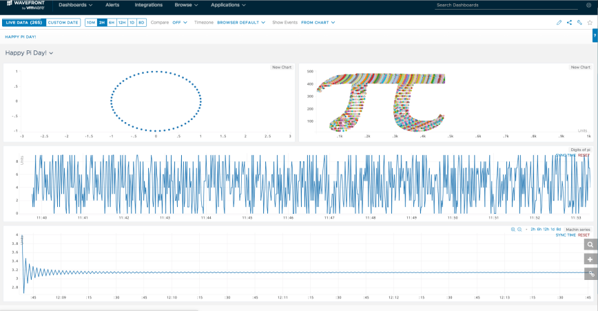
Happy Pi Day with Wavefront!

Celebrating Pi Day in style

Today is Pi Day! Ok. It only works in US date format, but still. Pi is so awesome that it should be celebrated around the world, regardless of date format.

And what better way to celebrate than some Wavefront geekness? Let’s dive right into it.

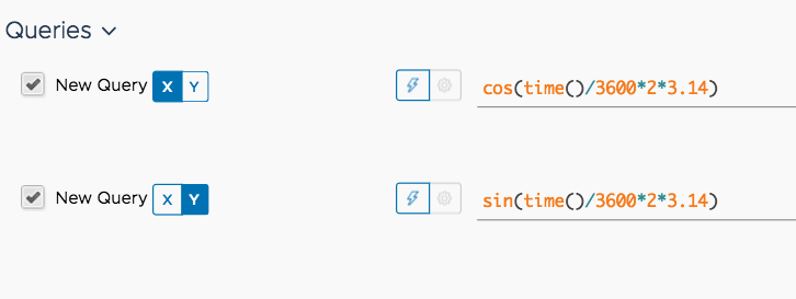
Ah, what a beauty! So first of all, we honor the mother of Pi: The circle. Of course, I could have written a script that fed the results of z = eit into Wavefront, but there’s an easier way. Thanks to the math functions in Wavefront, all I have to do is this:

All we have to do is to use the time parameter of the chart as our input and so some scaling. The rest is just the equation of the circle in its parametric form.

Scatter plot abuse

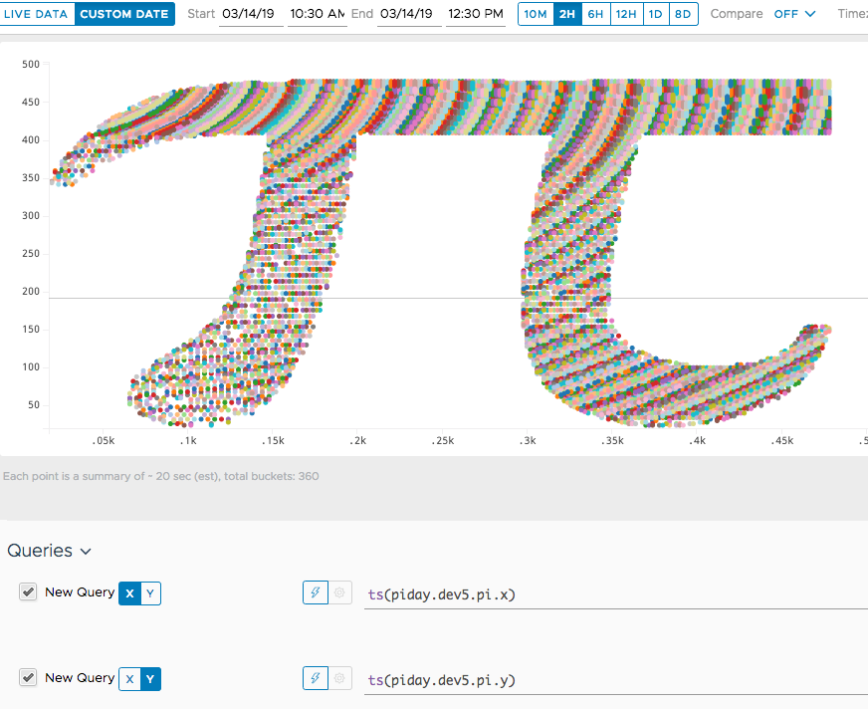
The next idea I had was to use a scatter plot to render a nice pi symbol. I wrote a small Go program that reads a JPG, scans it for black areas and sends the points where it found black. Then I put it on a Scatter Plot. OK, it took some tweaking, but it works. Here’s the code TODO.

Pi Digits that never go away

Next we need some pi digits. But digits are discrete things that should never be averaged or rolled up. But fret not, Wavefront is unique in that it NEVER rolls up any metrics, so our pi digits will be there for our grandchildren to see. Almost, at least.

Some more math geekness

The Manchin formula is an astonishingly inefficient way to compute Pi. But it makes for a cool time series graph where we can follow the progression of the series. Lots of bounding around!

So there you have it! My two favorite topics, Wavefront and math, all in one place. Happy Pi day!

vRealize Operations reporting on host profiles

Introduction

After I published my post about importing advanced host properties into vRealize Operations, a colleague told me that it was very nice, but the real kicker would be to somehow import the host profile compliance stature into vRealize Operation. Again, true to his motto “How hard can it be?”, the Viking set out to explore this challenge.

And, yet again, it turned out to be not hard at all. A few lines of Python code did the trick.

What’s a host profile?

Maybe a quick recap of host profiles could be useful. Host profiles were introduced several years ago in vSphere 4.0 and roughly serve three purposes:

  1. Work in conjunction with Auto Deploy to allow “stateless” hosts. These hosts don’t need any configuration at the host level, but read their configuration from a host profile when they boot and applies it on-the-fly.
  2. Report compliance against a host profile, i.e. list all deviations of host settings from the host profile.
  3. Proactively apply a host profile to an existing host to force it into compliance.

Under the hood, a host profile is just a long list of rules describing what the desired settings of a host should be. Host profiles are typically generated from a reference host. You simply select a host you consider correctly configured and vCenter will create all the rules to check and enforce compliance based on that host.

Host profiles and vRealize Operations

I often hear how nice it would be if vRealize Operations could check compliance with host profiles. So often that I decided to give it a try. As you may know, adding new functionality to vRealize Operations is really simple with e.g. Python. Building the host profile functionality required about a 100 lines of code.

Here’s how my script works:

  1. List all the host profiles known to a vCenter.
  2. Trigger a host profile compliance check. This will check the profile against all the hosts it’s attached to.
  3. Scan through the result and send notification events to vRealize Operations for each violation found.
  4. Define a symptom that triggers based on the event and compliance alert based on the symptom.

Running the script

For complete information about installing and running the script, refer to the Github site: https://github.com/prydin/vrops-import-hostprops

However, running the script is simple. Create a config file as described on Github and run this command:

python import-host-profiles.py --config path/to/config/file

If you want the check to run periodically, you should put the script in your crontab on Linux or in a scheduled job on Windows. Checking compliance of a large number of hosts take a while, so you should only run the script one or a couple of times per day.

The result

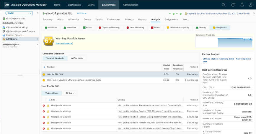
Once you have imported the alert definition and captured some host profile violations, you should see them under the Analysis->Compliance sub tab. It should look something like below. Of course, you can trigger email notifications or webhook notifications based on the compliance alert.

Screen Shot 2017-12-13 at 2.15.23 PM

Useful links

Code, installation instructions and manual:

https://github.com/prydin/vrops-import-hostprops


Importing Host Advanced Settings as Properties in vRealize Operations

How hard can it be?

Today I had a discussion with a colleague who wanted to build alerts against some advanced host settings that were not collected by default. I argued that one could build a script that imports the settings.

That’s when I had one of those “How hard can it be?” moments.

It turned out, it’s not that hard at all.

What’s an Advanced Setting?

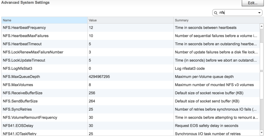
Objects in vCenter have a set of properties defining anything from licensing to file system buffers. Some of them have dedicated editors in the UI, but the bulk of them are just key/value-pairs accessible from the “Advanced Settings” menu option in vCenter.

Here’s what they look like in vCenter:

Screen Shot 2017-11-21 at 9.38.36 AM

Alerting on Advanced Settings

Alerting on settings and properties can be useful when trying to detect configuration drift. For example, some storage arrays work best with certain settings on NFS.MaxQueueDepth. By importing this setting, we can build symptoms and compliance alerts on this property so that we get alerted anytime this setting is changed from its optimal value.

Some host properties and settings are already captured vRealize Operations, but a lot aren’t. Using the simple script I created, we can import any host settings and make them reportable and alertable.

How it’s Made

The script is very simple and uses plain old REST calls (no SDK library) to vRealize Operations and pyVmomi to communicate with vCenter. It reads its settings from a YAML-file. That’s pretty much it.

The script only runs one import. If you want it to import periodically, you should install it as a cron-job (or scheduled task in Windows). Since host settings aren’t likely to change very often, it’s probably enough to run it once every hour. The code isn’t exactly optimized, so you may run into problems if you try to run it too often.

Since there are hundreds of settings and most aren’t needed, the script uses filesystem-like wildcards to select the settings. For example “NFS.*” gets you all the NFS settings

Configuration File

The script uses a configuration file to determine hostnames, usernames, passwords etc. Here’s a self-explanatory example:

# vCenter details
#
vcHost: "my-vcenter.corp.local"
vcUser: "pontus@corp.local"
vcPassword: "secret"

# vR Ops details
#
vropsUrl: "https://my-vrops.corp.local"
vropsUser: "demouser"
vropsPassword: "secret"

# Property pattern
#
pattern: "NFS.*"

What to do with it

There are many reasons one may need to import host settings. In my case, I needed to check the NFS.MaxQueue settings. In some environments, things tend to work poorly if it’s not set to exactly 64. So I collected that setting (and all the other NFS settings) by specifying the pattern “NFS.*”.

Here’s what I captured:

Screen Shot 2017-11-21 at 9.25.09 AM

Then I created a couple of symptoms and an alert with subtype “Compliance”. The subtype is important, since it makes it show up under the Analysis -> Compliance tab.

Here’s what the end result looks like:

Screen Shot 2017-11-21 at 9.35.02 AM

Where to Find it

You like it? Go get it!

The script can be found on my Github page:

https://github.com/prydin/vrops-import-hostprops


Geek corner: Finding Patterns in Wavefront Time Series Data using Python and SciPy

Introduction

Today we’re going to geek out even more than usual. Follow me down memory lane! My first job was to write code that processed data from testing integrated circuits. That was an eternity ago, but what I learned about signal processing turned out to be applicable to pretty much any kind of time series data.

So I thought I should play around with some of the time series data I have stored in Wavefront.

Of course, it deserves to be said that Wavefront can do almost any math natively in its web user interface. So I really had to think hard to come up with something that would give me an excuse to play around with the Wavefront API and some Python code.

Here’s the example I came up with: Find out which objects exhibits the highest degree of periodic self similarity on some metric. For example, tell me which VMs have a CPU utilization that have the strongest tendency to repeat themselves over some period (e.g. daily, hourly, every 23.5 minutes, etc.).

A possible application for this may be around capacity planning. By understanding the which workloads have a tendency to vary strongly and predictably over some period of time, we may be able to place workloads in such a way that their peak demands don’t coincide.

The first few paragraphs of this post should be interesting to anyone wanting to do advanced data processing of Wavefront data using Python. The final paragraphs about the math are mostly me geeking out for the fun of it. It can be safely ignored if it doesn’t interest you.

Problem Statement

The purpose of the tool we’re building in this post is to answer the question: “Which objects have the strongest periodic variation (seasonality) on some metric?”.

For example, which VMs have a CPU load that tends to have a strong periodic variation? And furthermore, what is the period of that variation?

Usage

It should be pointed out that this tool would need some work before it’s useful in production. It is intended as an example of what can be done.

To obtain the code, clone the repository from here or download this single Python file.

To run the code, you have to set the following two environment variables:

  • WF_URL – The URL to your Wavefront instance, e.g. https://try.wavefront.com
  • WF_TOKEN – Your API token. Refer to the Wavefront documentation for how to obtain it.
python fft.py name.of.metric

You can add the –plot flag at the end of the command to get a visual representation of the top periodic time series.

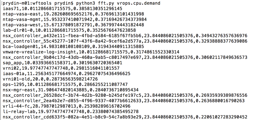
The output will be a list of object names, period length in minutes and peak value.

Example:

Screen Shot 2017-09-25 at 8.55.09 AM

Let’s pick an example and examine it!

nsx-mgr-west,31.45390070921986,0.17699407037085668

The first column is just the name of the object. The next column says that the pattern seems to repeat every 31.5 minutes. The third column is the relative spectral peak energy. The best way of interpreting that is by saying that 18% of the total “energy” of the signal can be attributed component that repeats itself every 31.5 minutes.

Let’s have a look at the original time series in Wavefront and see if we were right!

Screen Shot 2017-09-25 at 9.48.11 AM

Yes indeed! It sure looks like this signal is repeating itself about every 30 minutes.

A Note on Accuracy

Why did we get a result of 31.5 minutes? Isn’t it a little strange that we didn’t get an even 30 minutes? Yes it is and there’s a reason for it. The algorithm introduces false accuracy. In our example, we’re processing 5 minute samples, so the resolution will never get better than 5 minutes. Therefore, you should round the results to the nearest 5 minutes.

Data Source

The data for this example comes from one of our demo vRealize Operations instances and was exported to Wavefront using the vRealize Operations Export tool that can be found here.

Design

The design is very simple: We use Python to pull down time series data for some set of objects. Then we’re using the SciPy and NumPy libraries to perform the mathematical analysis.

SciPy

SciPy (which is based on Numpy) is an extensive library for scientific mathematics. It offers a wide range of statistical functions and signal processing tools, making it very useful for advanced processing of time series data.

High Level Summary of the Algorithm

There are many ways of finding self similarity in time series data. The most common ones are probably spectral analysis and autocorrelation. Here is a quick comparison of the two:

  • Spectral Analysis: Transform the time series to the Frequency Domain. This rearranges the data into a set of frequencies and amplitudes. By finding the frequency with the highest amplitude, we can determine the most prevailing periodicity in the time series data.
  • Autocorrelation: Suppose a time series repeats itself every 1 hour. If you correlate the the time series with a time shifted version of the same series you should get a very good correlation when the time shift is 1 hour in our example. Autocorrelation works by performing correlations with increasing time shifts and picking the time shift the gave the best correlation. That should correspond to the length of the periodicity of the data.

Autocorrelation seems to be the most popular algorithm. However, for very noisy data, it can be hard to find the best correlation among all the noise. In our tests, we found that spectral analysis (or spectral power density analysis, to be exact) gave the best results.

To find the highest peak in the frequency spectrum, we huse the “power spectrum”, which simply means that we square the result of the Fourier transform. This will exaggerate any peaks and makes it easier to find the most prevalent frequencies. It also creates an interesting relationship to the autocorrelation function. If you’re interested, we’ll geek out over that towards the end of this article.

Once we’ve done that for all our objects, we sort them based on the highest peak and print them. To make the scoring fair, we calculate the total “energy” (sum of “power” over time) and divide the peak amplitudes by that. This way, we measure the percentage that a peak contributes to the total “energy” of the signal.

Code Highlights

Pulling the data

Before we do anything, we need to pull the data from Wavefront. We do this using the Wavefront REST API.

query = 'align({0}m, interpolate(ts("{1}")))'.format(granularity, metric)
start = time.time() - 86400 * 5 # Look at 5 days of data
result = requests.get('{0}/api/v2/chart/api?q={1}&s={2}&g=m'.format(base_url, query, start),
                      headers={"Authorization": "Bearer " + api_key, "Accept": "application/json"})

Next, we rearrange the data so that for each object we have just a list of samples that we assume are spaced 5 minutes apart.

candidates = []
data = json.loads(result.content)
for object in data["timeseries"]:
    samples = []
    for point in object["data"]:
        samples.append(point[1])

Normalizing the data

Now we can start doing the math. First we normalize the data to force it to have an average of 0, a maximum of 1 and a minimum of -1. It’s important to do this to remove any and constant bias (sometimes referred to as “DC-component”) from the signal.

top = np.max(samples)
bottom = np.min(samples)
mid = np.average(samples)
normSamples = (samples - mid)
normSamples /= top - bottom

Turn into a power spectrum using the fft function from SciPy

Now that we have the data on a form we like, use a Fast Fourier Transform (FFT) to go from the time domain to the frequency domain. The output of and FFT is a series of complex numbers, so we take the absolute value (magnitude) of them to turn it into a real number. Finally, we square every value. This will exaggerate any frequency spikes and also has a cool relationship to autocorrelation we’ll discuss later.

spectrum = np.abs(fft(normSamples))
spectrum *= spectrum

At this point, we should have a spectrum that, for a good match, looks something like this. This corresponds to a signal repeating at a 60 minute interval.

Screen Shot 2017-09-25 at 10.38.50 AM

The algorithm we use is has very low accuracy at low frequencies (long cycles), so we dump the firs few samples. It’s important to sample enough of the signal. If we want to detect behaviors the repeat over, say, 24 hours, you should sample at least 5 days of data. This way, we can discard the lowest frequencies and still find what we’re looking for.

offset = 5
spectrum = spectrum[offset:]

Now we can find the peak by simply looking for the highest value in the array. Notice that we’re only looking in the lower half of the array. This is because of a property of the FFT known as “aliasing”. The latter n/2 samples will just be mirror image of the first n/2 ones.

Finding the peak and normalizing

maxInd = np.argmax(spectrum[:int(n/2)+1])

Next we scale the peak we found. In order to compare this peak with peaks we found from other objects, we need to somehow normalize it. A straightforward way of doing this is to estimate how much of the total energy this peak contributed with. Energy is the integral over power, but since we’re operating in a discrete time world, we can calculate it as a simple sum over the spectrum. The result will be the relative contribution this frequency has to the total energy.

energy = np.sum(spectrum)
top = spectrum[maxInd] / energy

The final step of the math is to convert the raw frequency (as expressed by an index in the spectrum array) to a period length.

lag = 5 * n / (maxInd + offset)

Filtering the best matches

We consider a “good” match a peak where the local spectral energy is at least 10% of the total energy. This is an arbitrary value, but it seems to work quite well.

if top > 0.1:
    entry = [ top, lag, object["host"] ]
    candidates.append(entry)

Sorting and outputting

Finally, once we’ve gone through every object, we sort the list based on relative peak strength and output as CSV.

best_matches = sorted(candidates, key=lambda match: match[0], reverse=True)
for m in best_matches:
   print("{0},{1},{2}".format(m[2], m[1], m[0]))

Extra Geek Credits: Autocorrelation vs. Power Spectrum

If you’ve made it here, I applaud you. You should have a pretty good understanding of the code by now.  It’s about to get a lot geekier…

Autocorrelation

Mathematically, autocorrelation is a very simple operation. For a real-valued signal, you simply sum up every sample of the signal multiplied by a sample from the same signal, but with a time shift. It can be written like this:

a(τ)=Σx(t)x(t+τ)

Let’s say a signal is repeating itself every 60 minutes. If we set the lag, τ, to 60 minutes, we should get a better correlation than for any other value of τ, since the signal should be very similar between now and 60 minute ago.

So one way to find periodic behavior is to repeatedly calculate the autocorrelation and sweep the value of τ from the shortest to the longest period you’re interested in. When you find the highest value of your autocorrelation, you have also found the period of the signal.

Well, at least in theory.

What ends up happening is that a lot of times, it isn’t obvious where the highest peak is and it could be affected by noise, causing a lot of random errors. Consider this autocorrelation plot, for example.

Screen Shot 2017-09-25 at 11.02.06 AM

One thing we notice, though, is that autocorrelations of signals that have meaningful periodic behaviors are themselves periodic. Here’s a good example:

Screen Shot 2017-09-25 at 11.05.33 AM

So maybe looking for the period of the autocorrelation would be more fruitful than hunting for a peak? And finding the period implies finding a frequency, which sounds almost like a Fourier Transform would come in handy, right? Yes it does. And there’s a beautiful relationship between the autocorrelation and the Fourier Transform that will take us there.

The final piece of the puzzle

If you’ve read this far, I’m really impressed. But here’s the big reveal:

It can be proven that autocorrelation and FFT are related as follows:

{\displaystyle {\begin{aligned}F_{R}(f)&=\operatorname {FFT} [X(t)]\\S(f)&=F_{R}(f)F_{R}^{*}(f)\\R(\tau )&=\operatorname {IFFT} [S(f)]\end{aligned}}}

Where R(τ) is the autocorrelation function.

In other words: The autocorrelation is the Inverse FFT of the FFT of the signal, multiplied by the complex conjugate of the FFT of the signal.

But an complex number multiplied by its own conjugate is equal to the square of the absolute value. So S(f) is really the same as |FFT[X(t)]|2. And since S(f) is the step right before the final Inverse FFT, we can conclude that it must be the FFT of the autocorrelation. So we can comfortably state:

The power spectrum of a signal is the exact same thing as the FFT of its autocorrelation!

Why it’s cool

Not only is the power spectrum a nice way of exaggerating peaks to make them easier to find. The peak of the power spectrum can also be interpreted as a measure of the prevailing period of the autocorrelation function, which, in turn, gives a good indication of the prevailing period of the data we’re analyzing.

Caveats

As I said in the beginning of this post, this code isn’t production quality. There are a few things that should be addressed before it’s useful to a larger audience.

  • All data is loaded into memory. That obviously won’t scale. Instead, we should used a streaming JSon parser and maybe split the query up into smaller shunks.
  • The calculation of the local spectral energy is very naive. It’s assuming that all the energy is concentrated in a single spike of unity length. It should be adjusted to account for spikes that are spread out across the spectrum.
  • The accuracy, especially at low frequencies, is rather poor. One possible improvement would be to use FFT to find the candidates and autocorrelation to fine tune the result.

Conclusion

The idea behind this post was to discuss how Python and a math library like SciPy can be used to analyze Wavefront data. Feel free to comment and to fork the code and make improvements!


Exporting metrics from vRealize Operations to Wavefront

Introduction

You may have heard that VMware recently acquired a company (and product) called Wavefront. This is essentially an incredibly scalable SaaS-solution for analyzing time-series data with an emphasis on monitoring. With Wavefront, you can ingest north of a million data points per second and visualize then in the matter of seconds. If you haven’t already done so, hop on over to http://wavefront.com/sign-up and set up a trial account! It’s a pretty cool product.

But for a monitoring and analytics tool to be interesting, you need to feed it data. And what better data to feed it than metrics from vRealize Operations? As you may know, I recently released a Fling for bulk exporting vRealize Operations data that you can find here. So why not modify that tool a bit to make it export data to Wavefront?

A quick primer on Wavefront

From a very high level point of view, Wavefront consists of three main components:

  • The application itself, hosted in the public cloud.
  • A proxy you run locally that’s responsible for sending data to the Wavefront application.
  • One or more agents that produce the data and send it to Wavefront.

You may also use an agent framework such as Telegraf to feed data to the proxy. This is very useful when you’re instrumenting your code, for example. Instead of tying yourself directly to the Wavefront proxy, you use the Telegraf API, which has plugins for a wide range of data receivers, among them Wavefront. The allows you to de-couple your instrumentation from the monitoring solution.

In our example, we will communicate directly with the Wavefront proxy. As you will see, this is a very straightforward way of quickly feeding data into Wavefront.

Metric format

To send data to the Wavefront Proxy, we need to adhere to a specific data format. Luckily for us, the format is really simple. Each metric value is represented by a single line in a textual data stream. For example, sending a sample for CPU data would look something like this:

vrops.cpu.demand 2.929333448410034 1505122200 source=vm01.pontus.lab

Let’s walk through the fields!

  1. The name of the metric (vrops.cpu.demand in our case)
  2. The value of the metric
  3. A timestamp in “epoch seconds” (seconds elapsed since 1970-01-01 00:00 UTC)
  4. A unique, human readable name of the source (a VM name in our case)

That’s really it! (OK, you can specify properties as well, but more about that later)

Pushing the data to Wavefront

Now that we understand the format, let’s discuss how to push the data to Wavefront. If you’re on a UNIX-like system, the easiest way, by far, is to use the netcat (nc) tool to pipe the data to the Wavefront proxy. This command would generate a data point in Wavefront:

echo "vrops.cpu.demand 2.929333448410034 1505122200 source=vm01.pontus.lab" | nc localhost 2878

This assumes that there’s a Wavefront proxy running on port 2878 on localhost.

Putting it together

So now that we know how to get data into Wavefront, let’s discuss how we can use the vRealize Operations Export Tool to take metrics from vRealize Operations to Wavefront. The trick is the newly added output format called – you guessed it – wavefront. We’re assuming you’re already familiar with the vRealize Operations Export Tool definition file (if you’re not, look here). To make it work, we need a definition file with an output type of “wavefront”. This one would export basic VM metrics, for example:

resourceType: VirtualMachine
rollupType: AVG
rollupMinutes: 5
align: 300
outputFormat: wavefront
dateFormat: "yyyy-MM-dd HH:mm:ss"
fields:
# CPU fields
  - alias: vrops.cpu.demand
    metric: cpu|demandPct
  - alias: vrops.cpu.ready
    metric: cpu|readyPct
  - alias: vrops.cpu.costop
    metric: cpu|costopPct
# Memory fields
  - alias: vrops.mem.demand
    metric: mem|guest_demand
  - alias: vrops.mem.swapOut
    metric: mem|swapoutRate_average
  - alias: vrops.mem.swapIn
    metric: mem|swapinRate_average
 # Storage fields
  - alias: vrops.storage.demandKbps
    metric: storage|demandKBps
 # Network fields
  - alias: vrops.net.bytesRx
    metric: net|bytesRx_average
  - alias: vrops.net.bytesTx
    metric: net|bytesTx_average

If we were to run an export using this configuration file, we’d get an output that looks like this:

$ exporttool.sh -H https://host -u user -p secret -d wavefront.yaml -l 24h 
vrops.cpu.demand 1.6353332996368408 1505122200 source=ESG-NAT-2-0 
vrops.cpu.costop 0.0 1505122200 source=ESG-NAT-2-0 
vrops.mem.swapOut 0.0 1505122200 source=ESG-NAT-2-0 
vrops.net.bytesTx 0.0 1505122200 source=ESG-NAT-2-0 
vrops.host.cpu.demand 15575.7890625 1505122200 source=ESG-NAT-2-0 
vrops.mem.swapIn 0.0 1505122200 source=ESG-NAT-2-0
...

The final touch

Being able to print metrics in the Wavefront format to the terminal is fun and all, but we need to get it into Wavefront somehow. This is where netcat (nc) comes in handy again! All we have to do is to pipe the output of the export command to netcat and let the metrics flow into the Wavefront proxy. Assuming we have a proxy listening on port 2878 on localhost, we can just type this:

$ exporttool.sh -H https://host -u user -p secret -d wavefront.yaml -l 24h | nc localhost 2878

Wait for the command to finish, then go to your Wavefront portal and go to “Browse” and “Metrics”. You should see a group of metrics starting with “vrops.” If you don’t see it, give it a few moments and try again. Depending on your load and the capacity you’re entitled to, it may take a while for Wavefront to empty the queue.

Here’s what a day of data looks like from one of my labs. Now we can start analyzing it! And that’s the topic for another post… Stay tuned!

The viking is back!

I’m back!!!

Hi folks!

I’m sorry I’ve been absent for such a long time, but I’ve been busy working on a cool project I unfortunately can’t talk about publicly… yet.

But now that I’ve surfaced again, check out my blog at VMware’s corporate Cloud Management blog!

https://blogs.vmware.com/management/2017/05/exporting-metrics-vrealize-operations.html

Expect more activity here in the very near future. And see you at DellEMC World next week! I’ll be in the Cloud Native Apps section of the VMware booth.

Generating Reports from vRealize Operations with Pentaho Reports – Part 1

Background

Although vRealize Operations has a really solid report generator built in, I often get the question how to hook up an external report generator to vRealize Operations. Sometimes users need some piece of functionality not found in the standard report generator and other times they want to bring data from vRealize Operations into an existing corporate reporting framework.

This led me to spend some time experimenting with Pentaho Report Designer and Pentaho Data Integration (also known as Kettle).

This discussion is going to get pretty technical. But don’t worry if you can’t follow along with every step! The transformation and report are available for download at the end of the article!

What is Pentaho and why do I use it?

Pentaho is an analytics and business intelligence suite made up of several products. It was acquired by Hitachi who sells a commercial version of it but also maintains free community version. In this post, we’re using the community version. Although I haven’t tested it with the commercial version, I’m assuming it would work about the same.

For this project, we’re using two components from Pentaho: Kettle (or data integrations) and Pentaho Reports. Kettle is an ETL tool that lets us take data from an arbitrary source and normalize it so it can be consumed by Pentaho Reports.

Getting the data

Typically, report generators are used with data from a SQL database, but since metrics in vRealize Operations reside in a distributed proprietary datastore, this is not a feasible solution. Also, database-oriented solutions are always very sensitive to changes between versions of the database schema and are therefore typically discouraged.

Instead, we are going to use the vRealize Operations REST API to gain access to the data. Unfortunately, Pentaho Reports doesn’t have an native REST client and there’s where Kettle comes in. As you will see, the report works by using a Kettle transformation as a data source.

Goals for this project

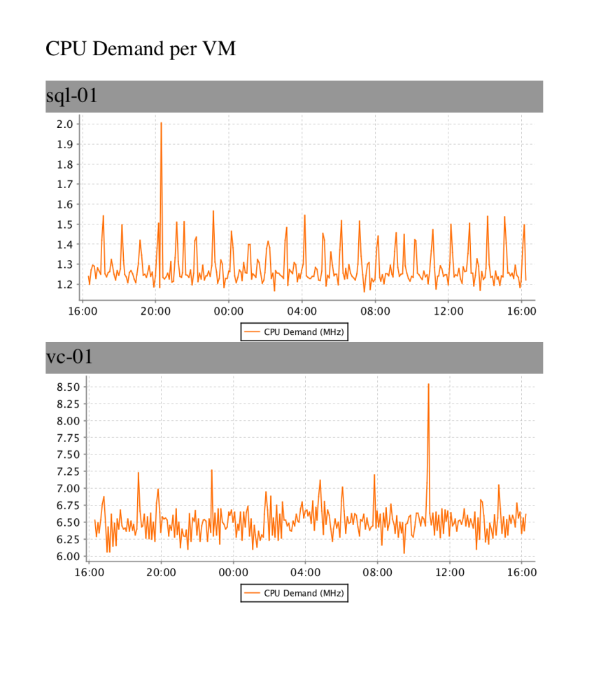
The goal for this project is very simple. We are just going to create a report that shows our VMs and a graph of the CPU utilization for each one of them. In subsequent posts, we are going to explore some more complex reports, but for now, let’s keep it simple. The report is going to look something like this:

screen-shot-2016-10-06-at-4-33-20-pm

Solution overview

DISCLAIMER: I am not a Pentaho expert by any means. In fact, I’ve been learning as I’ve been working on this project. If you know of a better way of doing something, please drop me a note in the comments!

This overview is intended to explain the overall design of the solution and doesn’t go into detail on how to install and run it. See the section “Installing and running” below for a discussion on how to actually make it work.

Kettle Transformation

To produce the data for the report shown above, we need to perform to major tasks: We need to ask vRealize Operation for a list of all eligible VMs and we need to ask it for the CPU demand metric for each one of them.

Kettle principles

Before we get into the design, it’s necessary to understand how Kettle operates. The main unit of work for Kettle is a rowset. This is essentially a grid-like data structure resembling a table in a SQL database. As the rowset travels through a transformation pipeline, we can add and remove columns and rows using various transformation steps.

Our Kettle Transformation

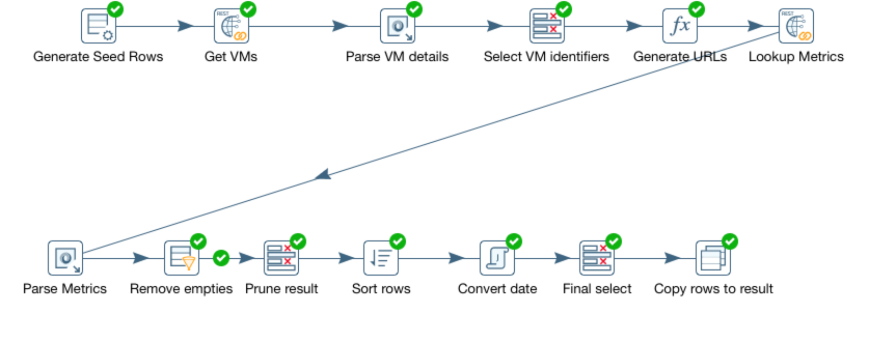
Transformations in Kettle are built using a graphical tool called “spoon” (yes, there’s a kitchen utensil theme going on here). Transformations are depicted as pipelines with each step performing some kind of operation on the rowset. This is what our transformation pipeline looks like. Let’s break it down step by step!

screen-shot-2016-10-06-at-4-51-07-pm

  1. Generate seed rows. Kettle needs a rowset to be able to perform any work, so to get the process started, we generate a “seed” rowset. In this case, we simply generate a single row containing the REST URL we need to hit to get a list of virtual machines.
  2. Get VMs. This step carries out the actual REST call to vRealize Operations and returns a single string containing the JSon payload returned from the rest call.
  3. Parse VM details. Here we parse the JSon and pull out information such as name and ID of the VM.s
  4. Select VM identifiers. This is just a pruning step. Instead of keeping the JSon payload and all the surrounding data around, we select only the name and the ID of each VM.
  5. Generate URLs. Now we generate a list of REST URLs we need to hit to get the metrics.
  6. Lookup Metrics. This is the second REST call to vRealize Operations. This is executed for each VM identified and will look up the last 24 hours of CPU demand metrics and return it as a JSon string.
  7. Parse Metrics. Again, we need to parse the JSon and pull out the actual metric values and their timestamps. This is actually akin to a cartesian product join in a database. The rowset is extended by adding one row per VM and metric sample. Thus, the number of rows is greatly increased in this step.
  8. Remove empties. Some VMs may not have any valid metrics for the last 24 hours. This step removes all rows without valid metrics.
  9. Sort rows. Sorts the rows based on VM name and timestamp for the metric.
  10. Convert date. Dates are returned from vRealize Operations as milliseconds since 01/01/1970. This step converts them to Date objects.
  11. Final select. Final pruning of the dataset, removing the raw timestamp and some other fields that are not needed by the report.
  12. Copy rows to result. Finally, we tell the transformation to return the rowset to the caller.

Lots of steps, but they should be fairly easy to follow. Although Kettle carries a bit of a learning curve, it’s a really powerful tool for data integration and transformation.

The result of our transformation will be a set of rows containing the name of the VM, a timestamp and a metric reading. Each VM will have 24 hours worth of metric readings and timestamps similar to this example:

Screen Shot 2016-10-06 at 5.00.51 PM.png

Our Pentaho Report

At this point, we have a nice data stream with one entry per sample, along with a resource name and a timestamp. Time to build a report! To do that, we use the graphical Pentaho Report Designer tool. Our report will look something like this in the designer:

screen-shot-2016-10-06-at-5-07-05-pm

Grouping the data

We could, of course, just put the data stream in the details section of a report and be done with it, but it wouldn’t make a very interesting report. All it would do is to list a long litany of samples for all the resources we’ve selected. So obviously, some kind of grouping is needed.

We solve this by inserting a, you guessed it, Group object into the report. A group object allows us to group the data based on some field or condition. In our case, we’ll group it by the “resourceName” (the name of the VM). Thus, we’ll have one group per VM.

Adding the graph

Now we can add the graph. But where do we add it? Let’s examine the sections in the screen shot above. There are couple of things to take notice of. First, anything we put in the Details section gets repeated for every row in the dataset. So if we put the graph there, we’d get thousands of graphs each showing a single datapoint. Clearly not what we want.

So what about the group? How can we put our graph at a group level? That’s where the group header and footer come into play. These are intended for summaries of a group. And since we want to summarize all the samples for a VM (which is the grouping object), that seems like a good place. Most tutorials seem to recommend using the group footer.

Configuring the graph

Once we’ve added the graph, we need to configure it. This is done simply by double clicking on it. First we select the graph type. For a time series this has to be set to “XY line graph”.

Once we’ve done that, we can start configuring the details. Here’s what it looks like:

screen-shot-2016-10-06-at-5-07-26-pm

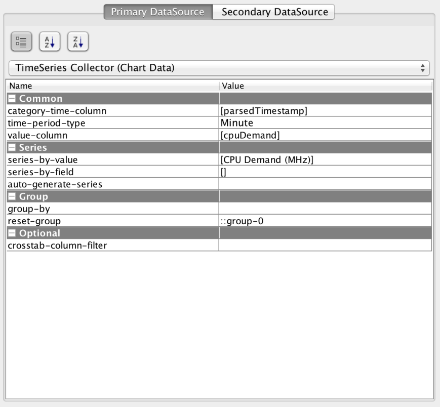
First, we need to select the TimeSeries Collector. This causes the data to be handled as a time series, rather than generic X/Y coordinates. Then we pick the “category-time-column” and set it to our timestamp field and set the “value-column” to “cpuDemand”.

Next, we edit the “series-by-value” to provide a graph legend.

Finally, we set the “reset-group” field to “::group-0”. This resets the data collection after every group, preventing data from being accumulated.

Parameters

Finally, we need some way of keeping track of variables like the hostname, username and password for the vRealize Operations instance we’re working with. This is done through parameters of the transformation that are exposed as report parameters. We can provide defaults values and even hide them from the user if we are always using the same instance and user. See below for a discussion on the parameters!

Installing and running

So far, it’s been a lot of talk about the theory of operation and the design. Let’s discuss how to install and run the report!

Installing Pentaho Reporting

  1. Download the Pentaho Reporting Designer from here.
  2. Unzip the file and go to the directory where you installed the software.
  3. Run it with report-designer.sh on Linux/OSX or report-designer.bat on Windows.

Allowing use of self-signed certs

If your certificate for vRealize Operations is signed by a well-known authority, you should be good to go. If not, you need to perform these two steps.

On windows

Edit the file report-designer.bat. Insert the java parameter “-Djsse.enableSNIExtension=false” on the last line. The line should look like this:

start “Pentaho Report Designer” “%_PENTAHO_JAVA%” -Djsse.enableSNIExtension=false -XX:MaxPermSize=256m -Xmx512M -jar “%~dp0launcher.jar” %*

On Linux/OSX

Edit the file report-designer.bat. Insert the java parameter “-Djsse.enableSNIExtension=false” on the last line. The line should look like this:

“$_PENTAHO_JAVA”-Djsse.enableSNIExtension=false -XX:MaxPermSize=512m -jar “$DIR/launcher.jar” $@

Finally, you will have to add the certificate from vRealize Operations to your java certificate store. This can be done by downloading your cert from your browser (typically by clicking the lock symbol next to the URL field) and following these instructions.

Installing Pentaho Data Integration (Kettle)

This step is optional and needed only if you want to view/modify the data transformation pipeline.

  1. Download Pentaho Data Integration from here.
  2. Unzip the file and go to the directory where you installed the software.
  3. Run it with spoon.sh on Linux/OSX or spoon.bat on Windows.

Allowing use of self-signed certs

If your certificate for vRealize Operations is signed by a well-known authority, you should be good to go. If not, you need to perform these two steps.

On Windows

Edit the file spoon.bat and insert the following line right before the section that says “Run” inside a box of stars:

On Linux/OSX

Edit the file spoon.sh and insert the following line right before the section that says “Run” inside a box of stars:

OPT=”%OPT% -Djsse.enableSNIExtension=false”
REM ***************
REM ** Run…    **
REM ***************

Finally, you will have to add the certificate from vRealize Operations to your java certificate store. This can be done by downloading your cert from your browser (typically by clicking the lock symbol next to the URL field) and following these instructions.

Running the report

  1. Start the report designer.
  2. Select File->Open and load the CPUDemand.prpt file.
  3. Click the “Run” icon.
  4. Select PDF.
  5. Fill in the host, username and password for vR Ops.
  6. Click OK.

Next steps

The purpose of this project was to show the some of the techniques used for running a report generating tool against vRealize Operations. Arguably, the report we created isn’t of much value. For example, it will only pick the 100 first VMs in alphabetical order and it’s rather slow. For this to be useful, you would want to pick VMs based 0n some better criteria, such as group membership or VMs belonging to a host or cluster.

We will explore this and other techniques in an upcoming installment of this series when we are building a more useful “VM dashboard” report. Stay tuned!

Downloadable content

The data transformations and report definitions for this project can be downloaded here.

Bosphorus now available as a Docker image!

Introduction

Bosphorus is a simple custom portal framework for vRealize Automation written in Java with Spring Boot. Read all about it here.

It’s already pretty easy to install, but to remove any issues with java-versions etc., I’m not providing it as a Docker image. This will be one of my shortest blog posts ever, because it’s so darn easy to use!

How to use it

Assuming you have docker installed, just type this:

docker run -d -p 8080:8080 -e VRAURL=https://yourhost vviking/bosphorus:latest

Replace “yourhost” with the FQDN of your vRealize Automation host. Wait about 30 seconds and point a web browser to the server running the Docker image. Don’t forget it’s running on port 8080. Of course, you can very easily change that by modifying the port mapping (-p parameter) in the docker command.

Bosphorus: A portal framework for vRealize Automation

I’m back!

I know it’s been a while since I posted anything here. I’ve been pretty busy helping some large financial customers, being a part of the CTO Ambassador team at VMware and preparing for VMworld. But now I’m back, and boy do I have some exciting things to show you!

One of the things I’ve been working on is a project that provides a framework for those who want to build their own portal in front of vRealize Automation. The framework also comes with a mobile-friendly reference implementation using jQuery Mobile.

This article is just a teaser. I’m planning to talk a lot more in detail about this and how to use the vRA API for building custom portals and other cool things. Below is an excerpt from the description on github. For a full description, along with code and installation instructions, check out my github page here: https://github.com/njswede/bosphorus

Background

This project is aimed at providing a custom portal framework for vRealize Automation (vRA) along with a reference implementation. It is intended for advanced users/developers of vRealize Automation who need to provide an alternate User Interface or who need to integrate vRA into a custom portal.

Bosphorus is written in Java using Spring MVC, Spring Boot, Thymeleaf and jQuery. The reference implementation uses jQuery Mobile as a UI framework. The UI framework can very easily be swapped out for another jQuery-based framework.

The choice of Java/Spring/Thymeleaf/jQuery was deliberate, as it seems to be a combination that’s very commonly used for Enterprise portals at the time of writing.

Why the name?

I wanted a name that was related to the concept of a portal. If you paid attention during geography class, you know that the Bosphorus Strait, located in Turkey is the portal between the Mediterranean Sea and the Black Sea. Plus is sounds cool.

Design goals

  • Allow web coders to develop portals with no or little knowledge of vRA
  • Implement on a robust platform that’s likely to be used in an enterprise setting.
  • Easy to install.
  • Extremely small footprint.
  • Extremely fast startup time.
  • Avoid cross-platform AJAX issues.

Features

Bosphorus was designed to be have a very small footprint, start and run very fast. At the same time, Bosphorus offers many advanced features such as live updates using long-polling and lazy-loading UI-snippets using AJAX.

Known bugs and limitations

  • Currently only works for the default tenant.
  • Only supports day 2 operations for which there is no form.
  • Displays some day 2 operations that won’t work outside the native vRA portal (such as Connect via RDP).
  • Only allows you to edit basic machine parameters when requesting catalog items. Networks, software components, etc. will be created using their default values.
  • In the Requests section, live update doesn’t work for some day 2 operations.

Future updates

I’m currently running Bosphorus as a side project, so updates may be sporadic. However, here is a list of updates I’m likely do post in the somewhat near future:

  • Support for tenants other than the default one.
  • More robust live update code.
  • Support for “skins” and “themes”.
  • Basic support for approvals (e.g. an “inbox” where you can do approve/reject)

Screenshots

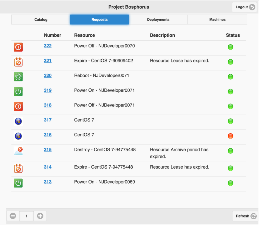
screen-shot-2016-09-09-at-4-52-22-pmscreen-shot-2016-09-09-at-4-53-21-pmscreen-shot-2016-09-09-at-4-57-02-pm

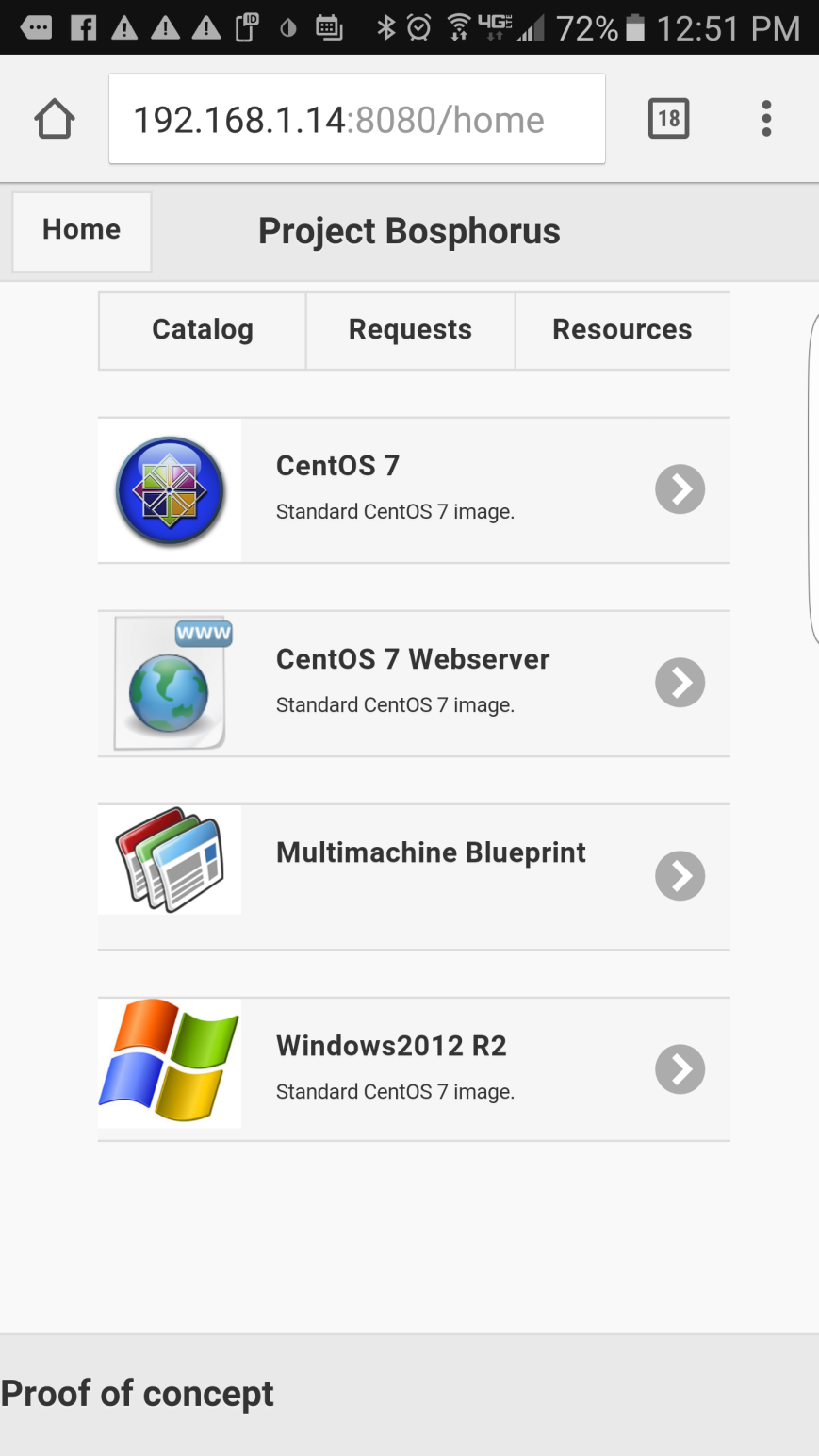
screenshot_20160812-125150